Le Coq Epicier
Identity
www.lecoqepicier.com
Launching a new delicatessen brand in today's very competitive market is highly challenging. Something of the highest quality needs to be offered to the public, along with truly unique characteristics.
The designer's task is not just to create an outstanding brand, but introduce the French products and traditions into the larger London culture, combining the heritage and the distinction of the French ingredients.
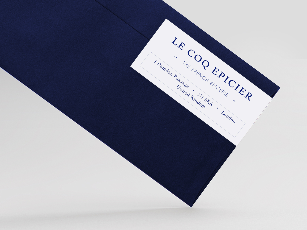
The logo was developed around one of the most recognised French symbols, the coq. To represent the epicerie tradition, a serif font was created to keep the minimal line of the brand.
Both elements, symbol and name, are in dark blue colour, that adds elegance to the logo but still being classic and timeless.